Amazon Price Tracking: Why Buy Box History Matters
Price volatility, Buy Box ownership, and historical price ranges reveal competitive dynamics that current price alone never will. Here is how to read them.
When most sellers evaluate a product, they look at the current price and move on. That single number tells you almost nothing useful. What actually matters is the price story over time: how stable it is, who controls the Buy Box, when prices drop and why, and whether the current price is a reliable baseline or a temporary anomaly.
This guide walks through the Price tab in AMZDataLens and explains how to extract actionable intelligence from every metric — Buy Box price, Amazon 1P presence, price volatility, and seller count movements.
The four price lines you need to understand
The AMZDataLens Price tab overlays four distinct data series on a single chart, each telling a different part of the competitive story.
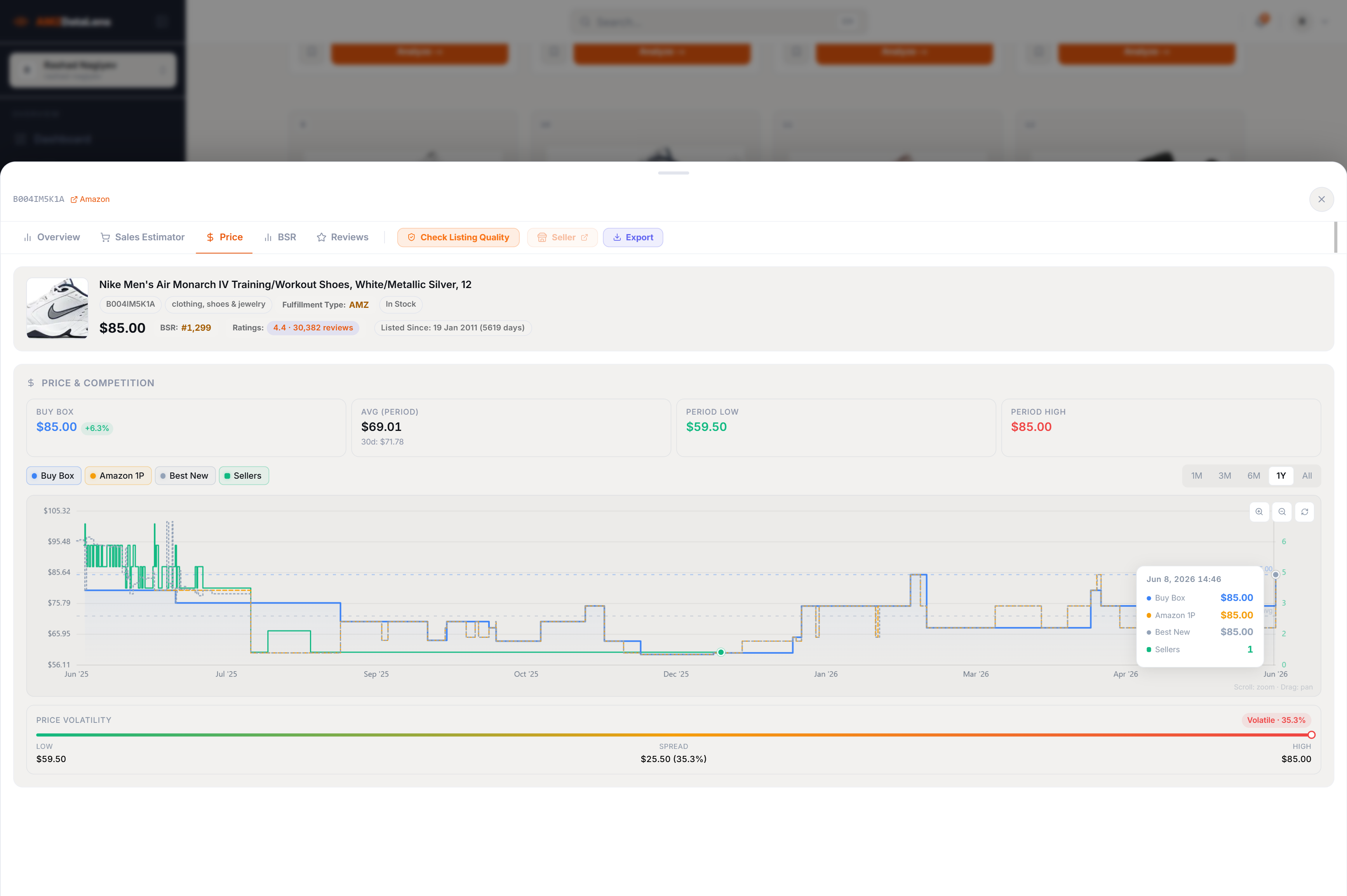
- Buy Box price — the price customers actually see and pay when they click Add to Cart. This is the only price that drives revenue. If you are not winning the Buy Box, your price is irrelevant
- Amazon 1P price — the price Amazon itself charges when it sells the product directly as a first-party seller. When this line appears, Amazon is your direct competitor on that ASIN
- Best New price — the lowest price from a new, non-Amazon seller. This is typically the third-party FBA seller price and represents your most direct competition
- Seller count — the number of active offers on the listing at any given time. When this drops to 1, one seller has full Buy Box control. When it rises, competition is intensifying
Reading the Buy Box price history
The Buy Box price chart is a compressed history of competitive dynamics on a single ASIN. Every significant movement has a cause — and identifying those causes is the real skill.
In the Nike Air Monarch IV example: the Buy Box price ranged from $59.50 to $105.32 over the 12-month period, with a current price of $85.00 — significantly above the all-time average of $69.01. The price volatility is classified as Volatile at 35.3% spread.
- Price drops with rising seller count — new competition entering. Multiple sellers are undercutting each other to win the Buy Box. Margin pressure is high
- Price spikes with falling seller count — stockout scenario. One seller remains, raises price, and captures premium demand. This is actually an opportunity signal
- Price spikes with Amazon 1P appearing — Amazon has entered the listing. This almost always suppresses third-party sellers and makes Buy Box winning very difficult
- Stable price with stable seller count — healthy, predictable market. The most reliable environment for a new entrant to plan margin and pricing strategy
The period from April 2026 onward in the Nike example shows a price jump from ~$65 to $85 with seller count dropping to 1. This is a classic stockout pattern. A seller who maintains reliable inventory during these windows captures a significant price premium — sometimes 20–40% above the normal market price.
Price volatility — what the spread tells you
AMZDataLens calculates price volatility as the spread between the period low and period high, expressed as a percentage of the high. A spread of 35.3% ($25.50 on an $85 product) is classified as Volatile.
Volatility is not inherently good or bad — but it requires different strategies depending on its cause.
- Low volatility (under 10%) — stable market. Pricing strategy is straightforward. Expect consistent margins but limited upside from price increases
- Medium volatility (10–25%) — some competitive pressure or seasonal movement. Monitor the seller count to understand whether drops are structural or temporary
- High volatility (25%+) — significant competitive dynamics or frequent stockouts. Requires active repricing strategy and strong inventory management to capitalise on premium windows
High price volatility driven by aggressive seller competition (many sellers entering and undercutting) is a red flag for a new entrant. High volatility driven by stockouts (few sellers, price spikes) is an opportunity. Always check whether the seller count rises or falls during price drops — that single data point tells you which scenario you are in.
The Amazon 1P signal
When the Amazon 1P price line appears on a chart, it means Amazon is selling the product directly — either as a vendor relationship or through its own retail operations. This is one of the most important signals in product research, and often an overlooked one.
Amazon almost always wins the Buy Box on ASINs where it sells 1P. It sets its own price without FBA fee considerations, has unlimited inventory, and is algorithmically preferred by the Buy Box system. Third-party sellers on Amazon 1P ASINs are essentially competing for the scraps of demand when Amazon is out of stock.
If the Amazon 1P line appears consistently throughout the price history — not just occasionally — consider this a significant barrier to Buy Box ownership. For product research, ASINs with persistent Amazon 1P presence are better used as market validation signals than as sourcing targets.
Using average price, not current price, for margin calculations
The most common margin calculation mistake is using the current Buy Box price as the basis for profit estimates. Current price is a snapshot — it may be at a seasonal high, a promotional low, or a stockout premium. None of these are reliable baselines.
Instead, use the 90-day average price from the Price tab as your margin calculation baseline. In the Nike example, the 90-day average is $72.81 — significantly lower than the current $85.00. If you calculated margins on $85 but the product spends most of its time at $72, your actual margin will be substantially lower than projected.
- Open the Price tab and note the 90-day average price
- Use this number — not the current price — as your revenue assumption in margin calculations
- Check the period low: if your margin turns negative at the period low price, you are exposed to margin wipeout during competitive windows
- Set your target sourcing cost so that you remain profitable at the 30-day average, not just at the current price
Price history as a competitive entry signal
Beyond margin calculations, price history tells you whether a niche is worth entering at all — and if so, when.
A product whose price has been steadily rising over 12 months (and BSR has been improving) signals genuine demand growth outpacing supply. This is the best entry signal: the market is growing, prices are holding, and there is room for a well-positioned new seller.
A product whose price has been steadily declining over 12 months (even if current BSR is good) signals a race to the bottom. New sellers keep entering, undercutting each other, and eroding margin for everyone. Avoid these unless you have a structural cost advantage.
The best entry signal combination: BSR improving (demand growing) + price stable or rising (supply not keeping up with demand) + seller count flat or declining (no new competition flooding in). When all three align, you have found a niche where the market is doing the work for you.
Price is not a number. It is a dynamic record of every competitive decision made on an ASIN over time. Sellers who read only the current price see the end result. Sellers who read the full price history see the story behind it — and that story tells them exactly where the opportunity is.
Tags

